A lot of business data in a company have a geographic relation and are therefore suitable for an analytical evaluation. With the products of business intelligence provider Qlik, the potential of this data can be clearly recognised and exploited. The special Qlik extension NPGeoMap also offers additional tools and possibilities for analysing geographic company data.
For example, NPGeoMap cannot only answer questions about “how”, but also questions about “where” even more efficiently: Which locations generate the most sales? Where are the customers with the highest buying power? In which regions could the sale of a product be particularly enhanced with the last advertising campaign?
The extension is not only suitable for classic sales analyses. Thanks to its intelligent data management, it also offers optimal performance even with large data quantities and can display information in four levels as areas and points or as a combination of both. NPGeoMap also enables the evaluation of visualisation of more complex geographic questions. Maps of the most important countries are already included in the extension and do not require an additional server installation. Individual maps – for example sales areas that are relevant to the company – can also be generated by means of further additional tools.
NPGeoMap offers the user various visualisation options to display the geographic data. They can be displayed in many different layers – for example, as polygons (areas) on background maps like GoogleMaps, BingMaps or OpenStreetMaps, as markers (points), great circles or even charts. The following display options are particularly efficient.
- Dynamic markers
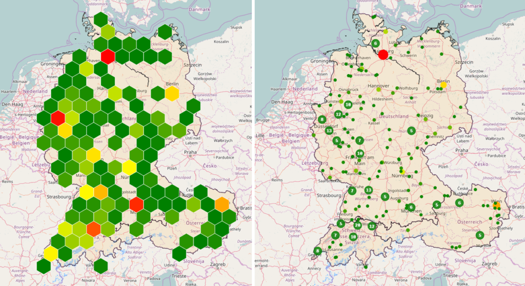
Dynamic markers are connected by a dimension to the Qlik Sense data model. Unlike static markers (static points), they can be selected, adjusted dynamically and presented in different ways. In addition, they can be grouped into circular or hexagonal clusters.

- Heatmaps
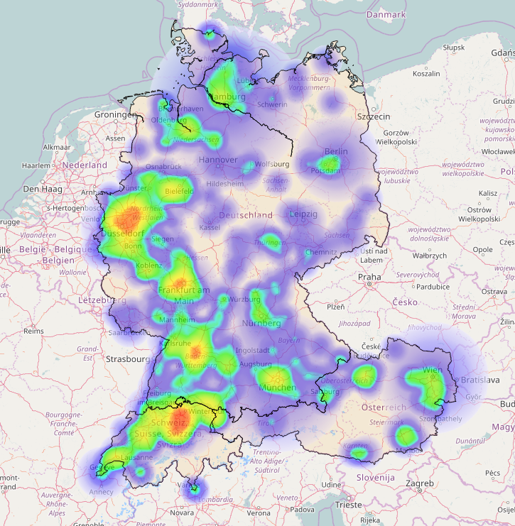
Heatmaps are generated by the “fusion” of markers. They are especially suitable for detecting high concentrations and gaps of markers, highlighting hotspots and low density in form of “heat images”. The concentration of the markers can be indicated by temperature gradations (e.g. “warm” high density areas in red, “cold” low density areas in blue). Additional options for intensity and transparency are available.

- Dynamic maps
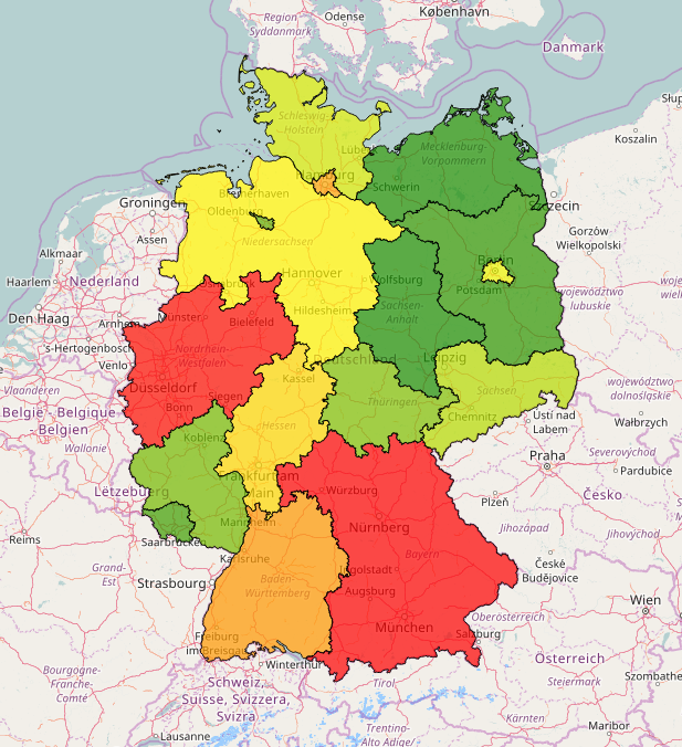
Dynamic maps are linked to the Qlik Sense data model by a polygon dimension. Similar to dynamic markers and unlike to static maps, they can be selected individually, modified dynamically and rendered in different ways. In the polygon coordinates, the data sources for the polygons can be specified.

- Lines and paths
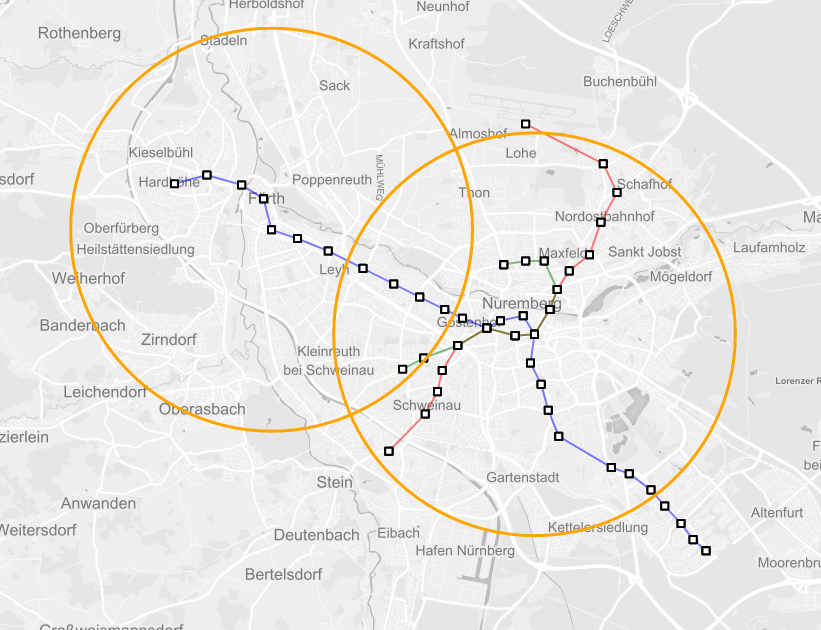
By adding end markers, lines and paths can be created between individual points. These can also be displayed as large circles (for example, to represent flight paths with respect to earth curvature) or bar graphs. Using radial spheres, selectable circumferences can be generated additionally. Isochrones also serve to visualise routes, for example.

Thanks to its 1-click installation, the extension is very easy to install and configure. The product is optimally integrated into the QlikView or Qlik Sense environment and can also be used offline and on mobile devices. For a comprehensive data protection, NPGeoMap reverts to the governance and safety rules of Qlik.
Would you also like to assess your geographic data as well and benefit from the extensive analysis and visualisation options of NPGeoMap in the process? We would be delighted to inform you about further advantages of the product.
