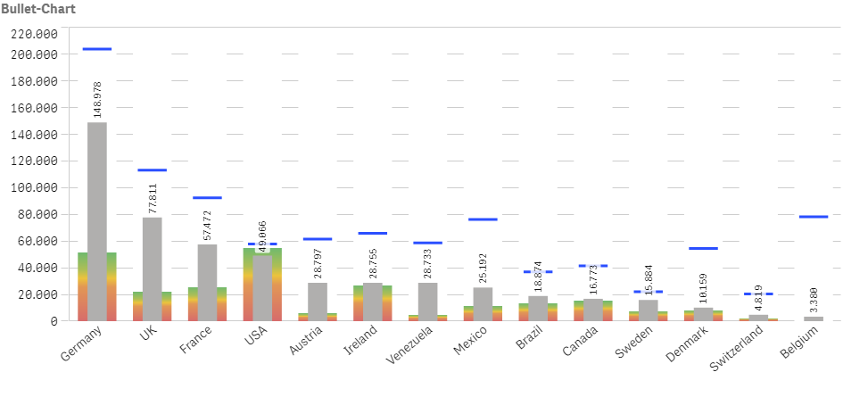
With its latest versions, the visualization capabilities in Qlik Sense have been steadily expanded. Especially the Bullet Chart has become a popular chart.
In order to offer users as many options as possible to visualize their data, Qlik has been expanding its Visualization Bundle with each new version for some time now. Last year, the Bullet Chart was introduced in Qlik Sense. Since then, the chart has become so popular that it was finally added to the standard charts with Qlik Sense June 2020.
With the Bullet Chart, several (usually up to three) measures can be displayed very clearly in one chart. For example, the Bullet Chart can be used to show the “performance” of a measure by comparing it to a target value and a qualitative range (good – average – poor). Finally, for each of the three measures a separate gauge is shown in the chart.
In this way, for example, the current sales of a company per country (measure) can be compared with target sales (marker) and the corresponding sales of the previous year (range). The range can also be highlighted in color using various limits (e.g. 25, 50 and 75 percent).

