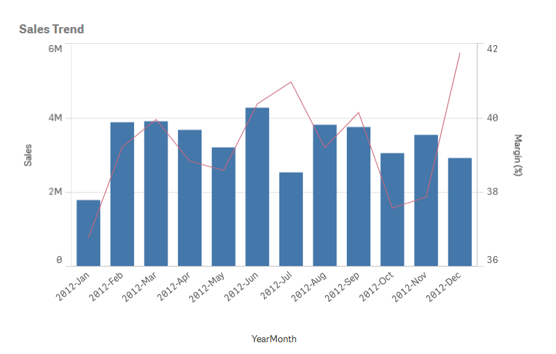
When analyzing complex enterprise data, it can be difficult to compare measure values due to their different scales. The combo chart in Qlik Sense facilitates this by using different measure scales.
Often, difficulties arise during data analysis in the company when the value ranges of the measures to be examined have a very different scale. For example, if one wants to combine sales figures with margin values (in %), the former can be displayed as usual in a bar chart. Because the difference between the numerical values for sales and margin is usually very large, the margin values would comparatively be almost invisible in the chart.
With a combo chart, the two values can be easily combined in Qlik Sense. Basically, this is simply a combination of a bar chart and a line chart. For example, bars can be used for sales values and a line can be used for margin values. By default in Qlik Sense, for bars, the ratio axis is on the left. For margin values, there is a separate axis on the right side in this case. Both measures use the same dimension.

In addition, a third metric (e.g. gross sales) can be added as a bar, as long as its values are in the same range as the sales figures. The new measure values can be either stacked or grouped with the sales values.
Combo charts allow the use of different measure scales – each displayed on the left and on the right side. They are ideal for displaying measure values that are difficult to compare graphically because their value ranges have a great difference in size. However, a combo chart can also be used to compare values of the same value range.
Combo chart equipped with new features
With the latest Qlik Sense releases, the functionality of the combo chart has been further enhanced. It has been enhanced with the ability to display vertically, reference lines based on measures and dimensions and new line and bar design options. Since a few weeks it is also possible to add bars on the secondary axis in a combo chart.
