Qlik has released the new client-managed version of its data analytics platform. Qlik Sense November 2021 has again been expanded, particularly in the areas of analytics and visualization.
With the November version, BI provider Qlik has rolled out the last release for Qlik Sense on Windows for this year. The new features, which were partially already made available for Qlik Sense SaaS in recent months, relate in particular to the analytics and visualization areas.
Enhancements in the analytics area
Qlik Sense November 2021 includes enhancements to Insight Advisor again. For example, the analysis period used by Insight Advisor can now be customized. Previously, a user needed appropriate permissions to change the business logic. To reduce effort and work time, the changes can now be made independently.
In addition, custom analyses in Insight Advisor now allow the user to generate custom responses for specific phrases. The definition of the corresponding analyses (e.g. comparison, ranking or clustering) is done via specified input fields. These new features optimize control over auto-generated analyses without defining complex rules.
Moreover, it is now possible to use the period analysis to compare changes in a measure of the current period versus the previous one. The deviations between the two analysis periods can finally be displayed and analyzed in a line chart.
New features in the visualizations
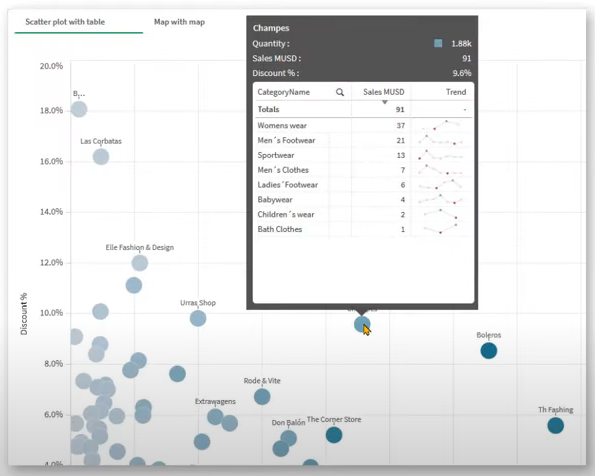
The area of visualizations has also been expanded again with Qlik Sense November 2021. It is now possible to embed a master visualization inside a tooltip. In this way, the user can visualize an overview first and then search for details directly in the chart by drill-down.

The label options in Qlik Sense have also been revised. The new “Layered” label orientation provides more control and flexibility in the display of charts. In addition to the existing options (e.g. “Automatic”, “Horizontal” and “Tilted”), labels can now also be layered on the X-axis to create more space for the actual chart.
The labels of the line chart have also been extended with the new option “All”. This keeps the data labels always visible. The “Auto” option, which automatically adjusts labels to fit the available space, also displays more labels now.
In addition, to gain more context and insights, images can be added to rows in straight tables via URL. Master visualizations, master dimensions, and master measures can also be edited directly from the property panel. Furthermore, the default tab can now be set while creating or editing a container.
