BI provider Qlik has released the new client-managed version of its data analysis platform. Qlik Sense February 2022 has again been expanded, particularly regarding Insight Advisor and the visualization options.
With the February version, Qlik has rolled out the first release for Qlik Sense on Windows for this year. The new features and optimizations again relate in particular to the analytics and visualization area. Among other things, Insight Advisor and the grid chart have been enhanced. Some of the improvements were available earlier for the SaaS version of Qlik Sense as seen before.
New features in Augmented Analytics
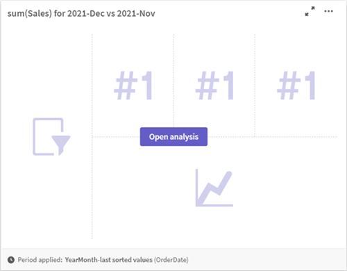
Insight Advisor has once again received some functional enhancements with Qlik Sense February 2022. For example, meaningful period over period analyses are now created in the form of entire dashboards when users select or search for applicable fields. The dashboards include multiple charts and KPIs, as well as a filter area, which enables selection and thus deeper analyses.

Business logic in Insight Advisor now allows the definition of default grain for a calendar period (e.g., yearly, quarterly, monthly). Finally, if default calendar periods are created in the behaviors for analyses, the new February release allows users to specify whether the defined grain should be used or ignored for a particular analysis.
New parameters have also been added to the business logic in Insight Advisor for even more granular analyses. These include setting the trend direction and sort order for a metric, specifying the favorite analysis types to be used by the system, and specifying the overall aggregation type for complex expressions.
Enhancement of visualization options
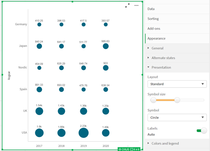
Visualization options have also been expanded again in Qlik Sense February 2022. For example, the grid chart can now display labels for each data point in the chart, indicating the associated value of the measure.

Moreover, because the Heatmap extension for Qlik Sense will no longer be available, the grid chart now includes the Heatmap option in addition to the Standard layout, which adds heatmap functionality to the chart.
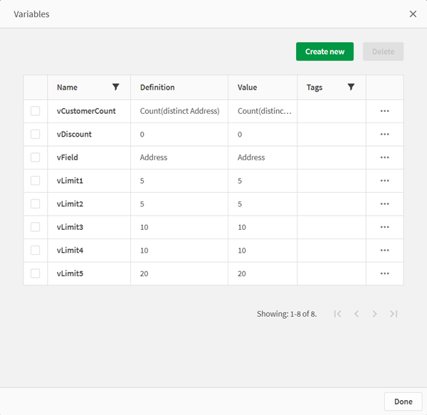
An updated, more flexible dialog now simplifies the management of diagram variables. For more efficient work – also in a team – it displays all variable elements (e.g. name, description and value) and allows adding, searching and duplicating variables. In addition, up to 20 variables can be deleted simultaneously, which also makes manual work easier.

New features in connectors and platform
In addition to the optimizations in the areas of analytics and visualization, Qlik Sense February 2022 also offers other innovations. For example, a new connector for Google Drive is available and the Snowflake connectivity has been improved. Moreover, various format options are now supported to export tables to Excel easier. Users with the appropriate permissions now have access to self-service task management in the Hub.
