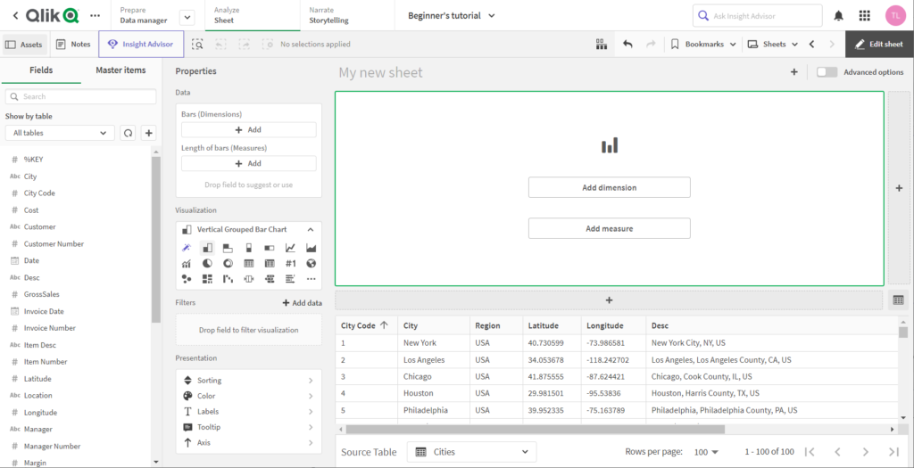
In order to provide both new and advanced users with an optimal user experience, Qlik introduced a new, simplified authoring interface for Qlik Sense SaaS at the beginning of July with several new features and improvements.
The streamlined authoring is specifically aimed at simplifying the creation of dashboards and apps. The new features and enhancements accelerate layout and chart creation, simplify filtering and provide quick access to frequently used properties and functions.
Data tables and fields can be accessed directly in the sheet edit view. The new authoring experience thus increases data literacy and application development learning curves for creators of all skill levels.

New features for fields and selection
Individual field values can now be expanded and displayed using the field panel. A frequency count and histogram are also displayed along with the values. A symbol at the fields informs whether the values are strings, numbers, dates or geographical values.
In addition, the behavior of values has been changed so that a selection can now be made during editing without having to switch to view mode. The selection is displayed both in the field panel and in the selection bar.
Updated data properties
The data panel has been moved to the left so that it is closer to the fields and charts. There are also multiple drop zones for dimensions and measures. In addition, it is possible to decide whether the field should be used as a dimension or as a measure or whether Qlik Sense should make a suggestion for this.
Improved visualization features
For more convenience, an auto chart is created by default when entering the simplified authoring. This changes as measures and dimensions are dropped and selects the most appropriate visualization. The visualization properties can be used to pick and override another chart. The panel contains the most frequently used charts.
New filter panel
The new authoring provides a completely new filter panel. It allows filtering at the chart level, for example, to exclude individual dimension values. There are five types of filters that can be used to include or exclude field values:
– Pick dimension values
– String search for values
– Numeric comparison of values
– Numeric comparison based on an expression on another field
– Clear selection, where the chart ignores the current selection
The listed filters are only visible in the “Simplified Authoring” and not in the “Advanced Authoring”.
Optimized display properties
Presentation properties provide quick access to the most common settings for sorting, coloring, labeling, tooltips, and axes. The labeling options now include font size, color, style and also font family, and are expected to be expanded in the future.
Helpful data table at the interface bottom
The new simplified authoring includes a data table with all fields at the bottom of the user interface. Since this is not part of the canvas, the data table can be used as an aid to data discovery and as a reference when building the dashboard. The table can be sorted. In addition, a selection of field values can be made.
Smart grid
The grid has also been improved. With new “+” buttons on the right and at the bottom, new objects can be created with a single click. It is possible to drag the borders to resize two charts at the same time. The handle at the top left can also be used to drag objects into new positions, maintaining the size as much as possible.
The new authoring view can be enabled by administrators in the tenant. During app creation, users can then switch between the new authoring view and an expanded layout, also known as the “Sheet Editor” from previous versions of Qlik Sense.
The following YouTube video provides an overview of the new “Simplified Authoring”:
With your click the video is loaded on YouTube. Please note that data is transmitted to YouTube. Please also note our privacy policy.
