BI provider Qlik is always looking to offer the most comprehensive and modern design options for visualizations in Qlik Sense. For this purpose, the possibilities are regularly improved and equipped with new functionalities. In this context, some chart types in the cloud version were recently optimized again.
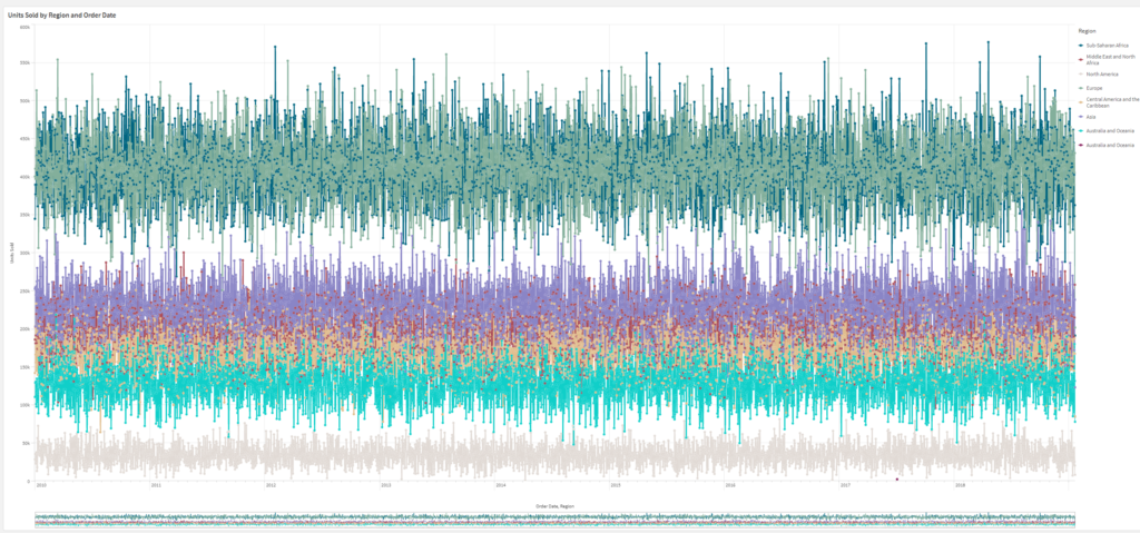
For example, the number of visible points and lines displayed in line charts can now be controlled. The maximum number of visible points is 50,000, and the maximum number of visible lines is 1,000. The new options are available for line charts with a continuous dimension axis.

In addition, the font style for titles, subtitles, and footnotes in scatter plots and text and image objects can now be customized. This will provide more customization options for visualizations in the future. The new options for changing font type, size, color and emphasis are available in the new General tab.
App developers can now add custom background colors or images to straight tables, pivot charts, pie charts and bar charts. Any image from the media library can be used as a background. It is also possible to select individual background colors as well as colors by expression.
