BI provider Qlik has released the new version for Qlik Sense on Windows. Qlik Sense February 2024 once again focuses in particular on innovations in the visualization area.
The February release is the first client-managed version this year and includes a new pivot table, extended design options for various charts and a new layout container.
New pivot table
Qlik Sense February introduces a new pivot table that offers a range of new functions. The new pivot table is included in the visualization bundle and will replace the native pivot table next year. The table includes the following functionalities:
• Dimension headers
• Custom symbol for null values, foreground and background color
• Grid styling with width and color
• Font for size, color and family for headers and cell contents
• Totals styling and placement options (top or bottom)
• Options for column width, auto, in pixels or with percentage specification
• Scrollbars outside the chart
• Interactive sort of dimensions
Layout container added
The layout container is a new component in the dashboard bundle in which charts can be placed in a free form with or without a grid. The diagrams can also be overlapped, stacked and controlled with show conditions. The layout container can be used in a variety of ways, but is particularly useful for
• Grouping charts
• Combining charts to create new visualizations
• Creating composite KPIs
• Grouping and reusing user controls and buttons
• Creating aesthetic dashboards
Optimized design of grid, funnel and Sankey charts
Grid, funnel and Sankey charts have been equipped with a new property panel for styling. The design includes general settings for title, subtitle, footnote, background, border and shadow as well as chart-specific settings for axis and value labels.
Styling the filter pane
The filter pane now also offers more properties for styling. These include general settings for the title font, background, border and shadow. New are also chart-specific styling for the font of the header and content as well as color settings for the selection state, background color and image.
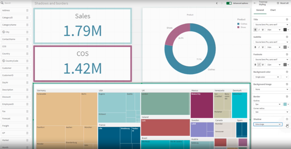
Improved borders and new shadows
Most charts now contain new settings for borders and shadows. Charts automatically inherit the border setting of the respective theme, but the border width and color setting can now be adjusted individually for each chart.
The shadow is also a new property for charts. This creates a shadow outline around the chart (with options for size and color) to create a depth effect. It can be used to highlight certain elements, for example.

Borders and shadows are particularly useful in the new layout container, where charts can also be overlapped and stacked.
Copy and paste styling settings
Styling settings can now be copied from one chart to another via a new menu choice. This improvement makes designing charts and working with them easier – especially with the now very extensive styling options.

