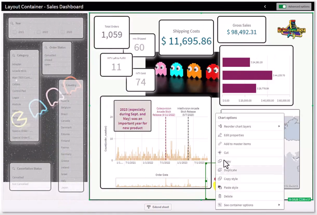
The recently new added Layout Container in the Qlik Dashboard Bundle provides a new object with a free layout of charts and the ability to stack visualizations, combine charts into new visualizations, and multi-select and group objects for easier resizing, positioning and alignment.
Charts can be placed freely in the Layout Container (with or without docking to the grid). They can also overlap and be stacked and controlled via various show conditions. The Layout Container therefore offers numerous different application options, but is particularly useful for:
– Grouping charts and objects
– Combining charts into new visualizations
– Creating composite KPIs
– Grouping and reusing user controls and buttons
– Creating aesthetic dashboards
Layout Containers can be used to insert any number of visualizations in a limited space. They can therefore contain several visualizations, even though it only takes up a small amount of space on a sheet. When the sheet is expanded to full screen, the individual charts are also expanded and become fully visible. The visualizations can also be shown or hidden based on certain conditions (e.g. value of a variable or user accessing the chart).

Limited box – numerous visualizations
The Layout Container is therefore particularly useful for showing a user-defined display with several charts as a single compressed unit. In contrast to the usual Container, in which tabs can be used to navigate through various charts, the Layout Container also enables a freely customizable layout of the individual charts. As the Layout Container offers a sheet-like arrangement of the visualizations, several sheets can be functionally stored within one sheet, which can be expanded for a more detail.
The following video from Qlik provides a comprehensive overview as well as tips and tricks regarding the new Layout Container:
Mit Ihrem Klick wird das Video bei YouTube geladen. Bitte beachten Sie, dass dabei Daten an YouTube übermittelt werden. Beachten Sie auch unsere Datenschutzhinweise.
