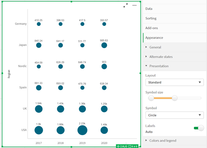
For the best possible analyses and visualizations, Qlik regularly improves the capabilities in Qlik Sense charts. Therefore, at the end of November, the functionalities in grid and line charts were again extended in the cloud version of Qlik Sense.
For next February, Qlik has canceled the heatmap extension for Qlik Sense. So that heatmaps can still be used for analyses, the grid chart in Qlik Sense now also includes the “Heatmap” option in addition to the “Standard” layout. With the “Heatmap” option, so functions of a heatmap chart can continue to be used in the grid diagram in the future.
In addition, labels can now be displayed for each data point in the chart. The labels indicate the value of the measure for the respective data point.

Time series forecasting in line charts
The time series forecast function is now also available in the line chart. This allows you to forecast the future based on historical data. The time series forecast continues the historical data for this purpose. Users can add a forecast to a line chart via the properties and define the calculation method, the time period and the confidence intervals for the forecast.
Calculation methods include SSA (singular spectral analysis), a non-parametric, time-aware method used in most cases, and OLS (ordinary least squares), a more linear method that uses regression techniques. Finally, with time series forecasting, there is the possibility to easily create forward-looking views – without complex modeling or external calculations.
